SK 101
Our new look
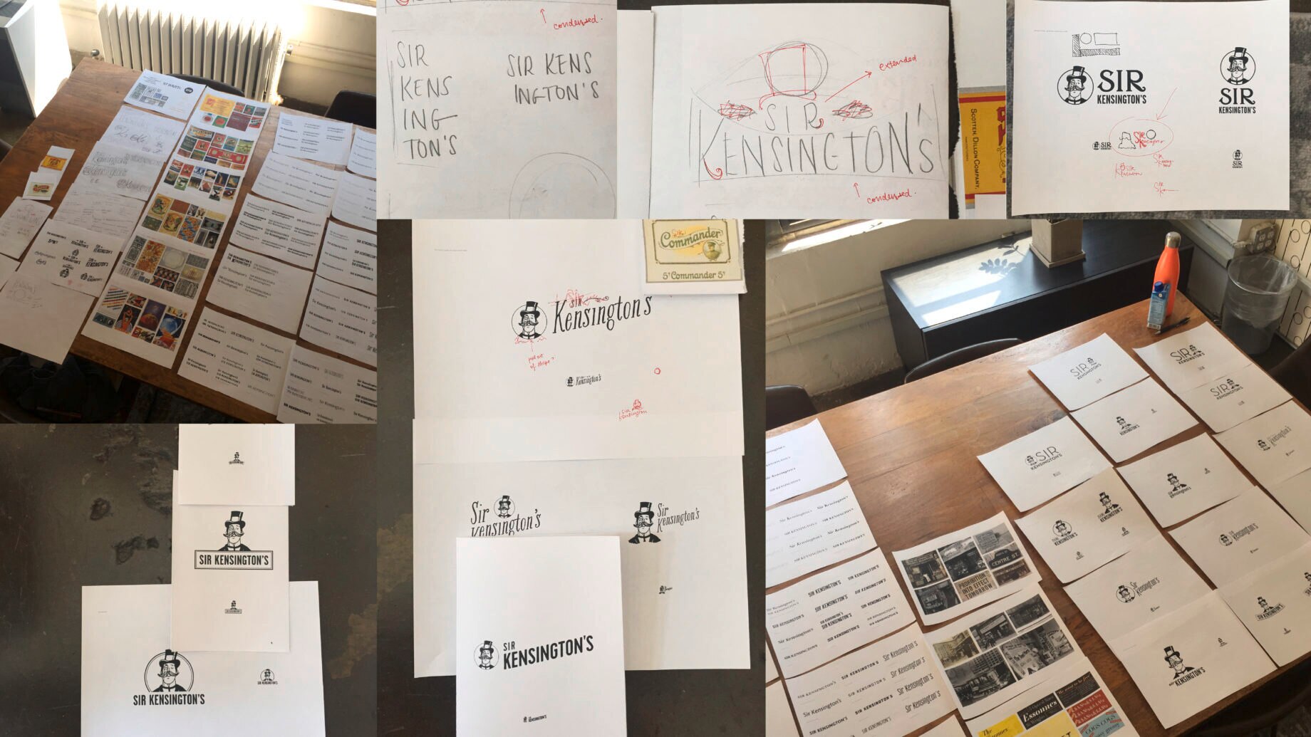
Our brand redesign, which includes a new logo, brand toolkit, packaging system, website, and content strategy, was developed in-house by our small-but-mighty internal agency.
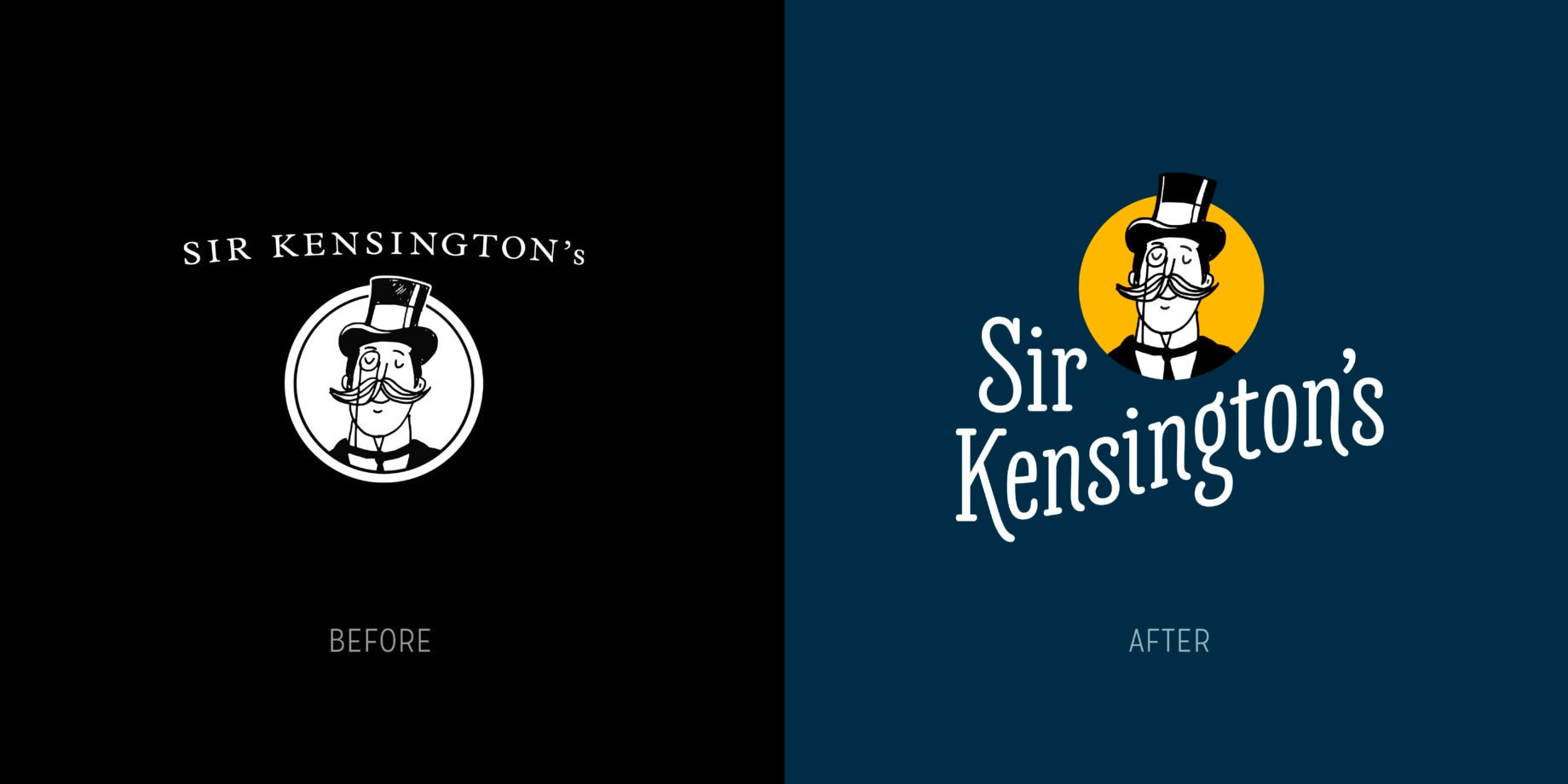
As the saying goes, “If it ain’t broke, don’t fix it.” Avoid attempting to correct, fix, or improve what is already sufficient.
Spend some time around the Sir Kensington's team and you'll know there is something delightfully incongruous about “sufficient” and “Sir Kensington’s”. Our company was founded on curiosity and wonder and an insatiable hunger for exploring potential. We tinker and we toy; we press and we prod. We question that which just “is” and wonder how it might be improved upon.
All of this is to say, although our former brand was by no means “broken”, it was certainly not befitting of Sir Kensington, our mustachioed, monocled guiding spirit.
Our purpose
“We believe food is the most powerful human connector. To protect that superpower, we work to defend the dignity of food.”
The redesign started by tapping into Sir Kensington’s strongly-held and deeply-authentic culture—one that I’ve come to know and love as fearlessly integrous, relentlessly charming, and inspiringly ambitious. Starting with strong strategic footing meant that we were able to build a visual toolkit that’s not only beautiful, unique, and functional, but also reflects a vision that’s about far more than mayonnaise.
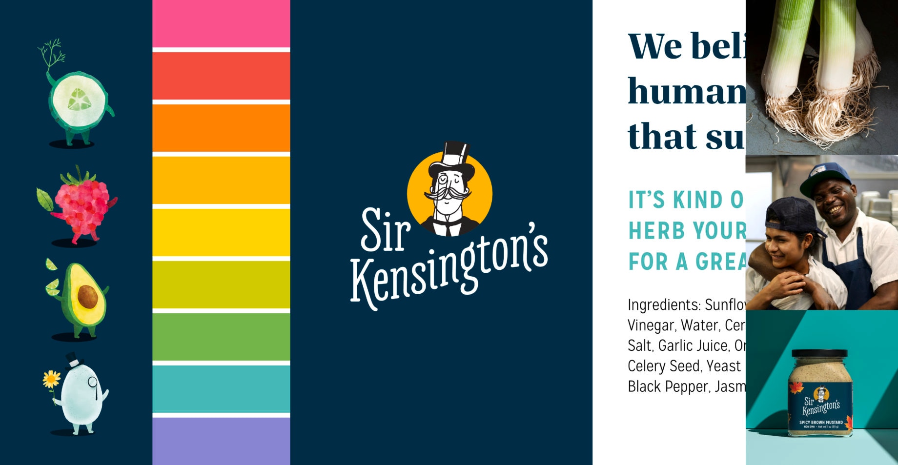
Sir Kensington's Brand Toolkit: Illustration + Color + Logo + Typography + Photography
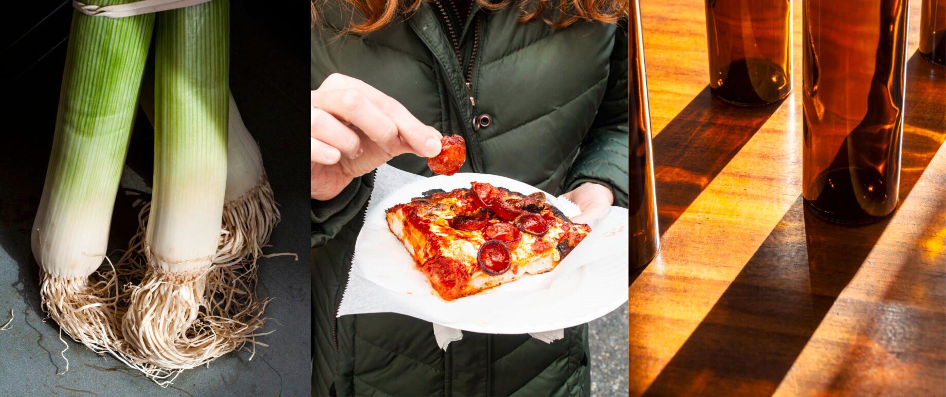
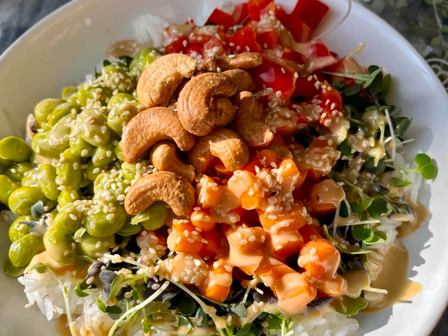
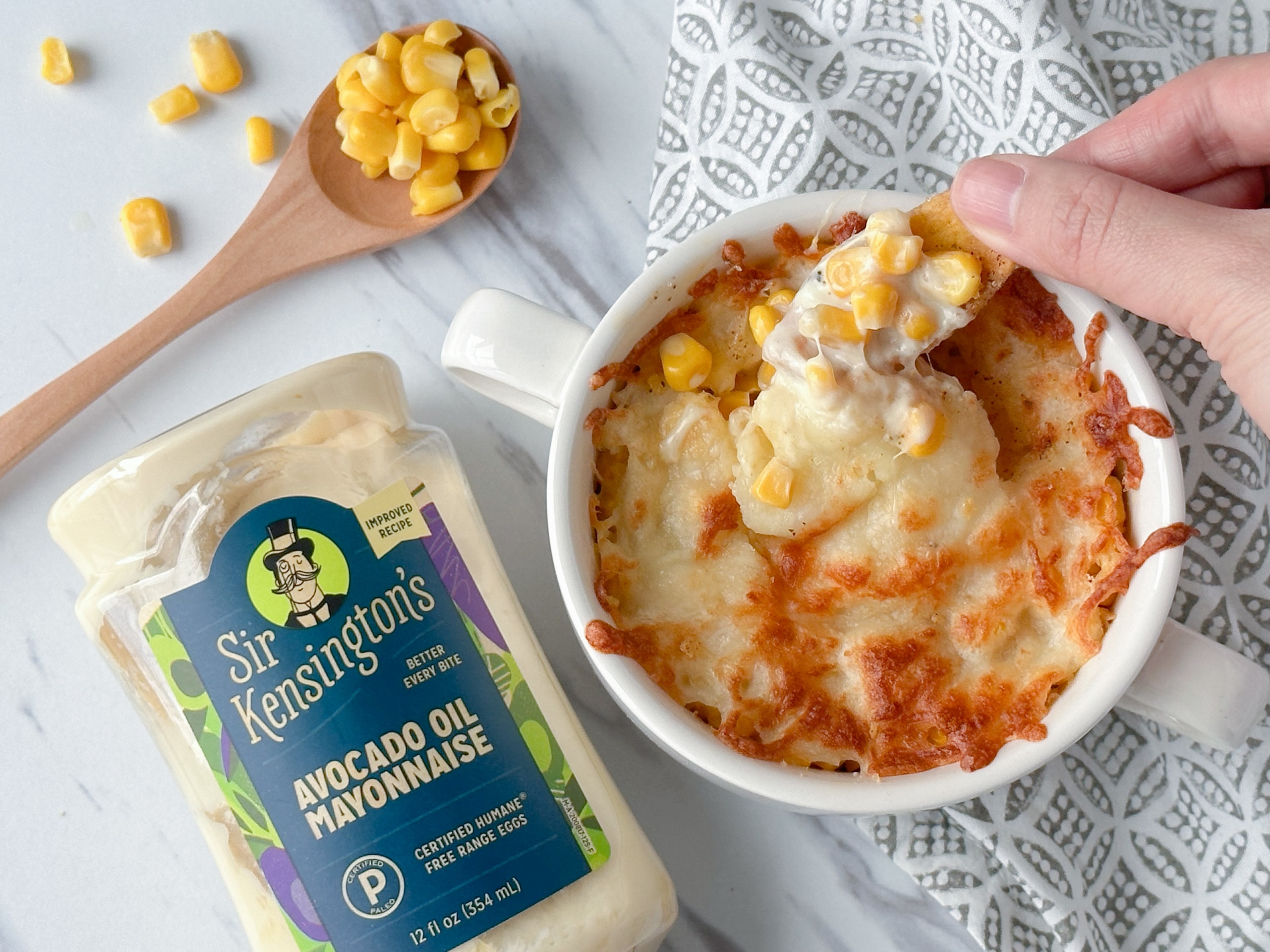
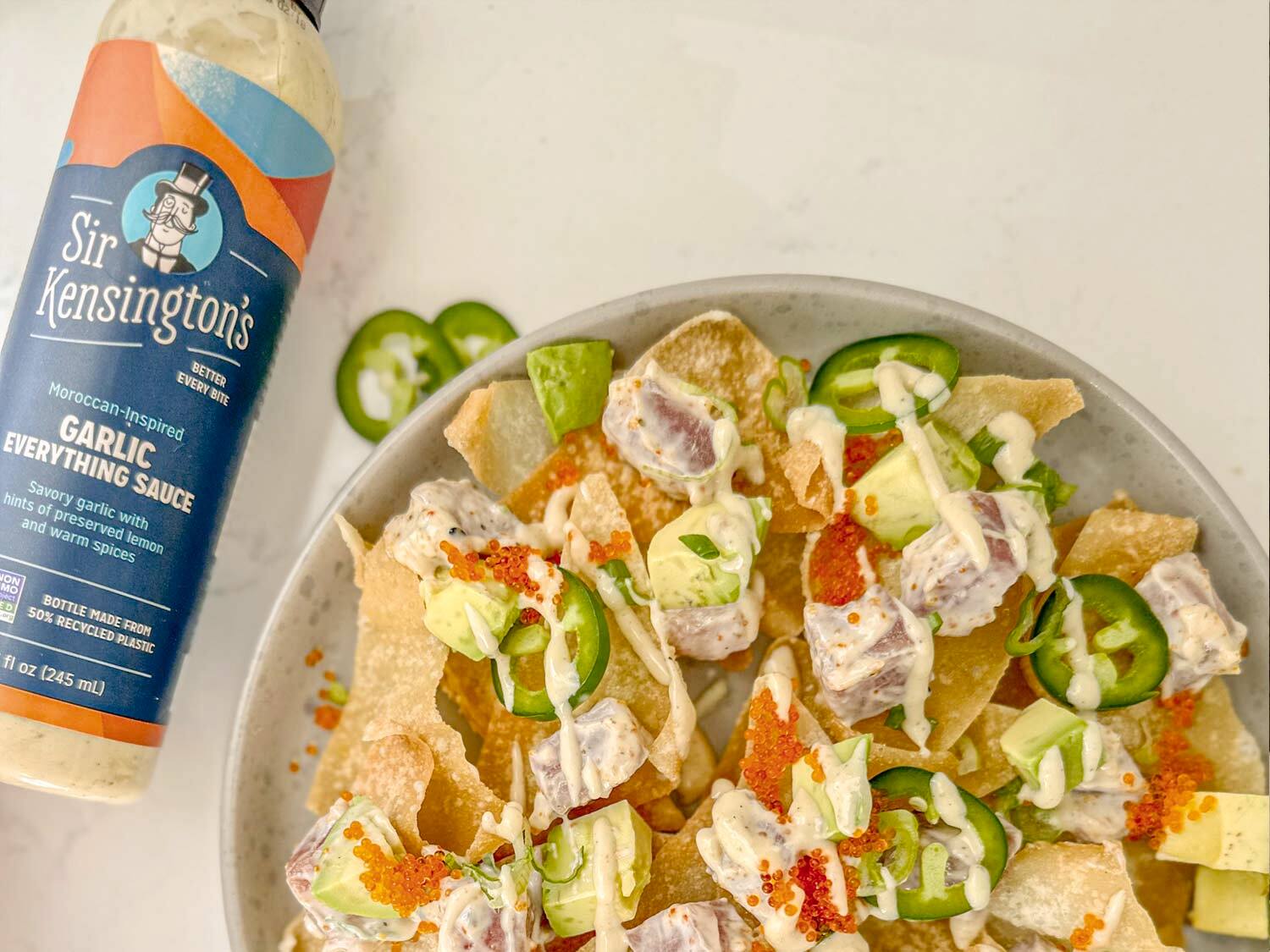
A revamped photographic style.
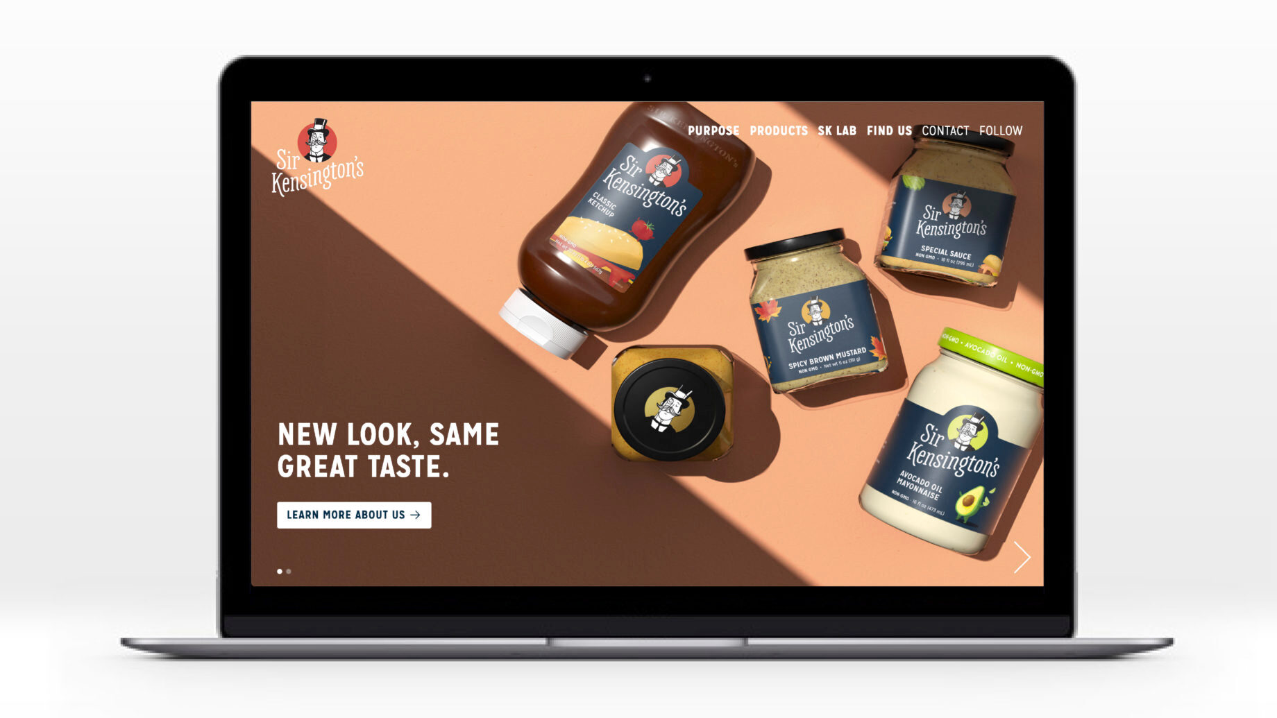
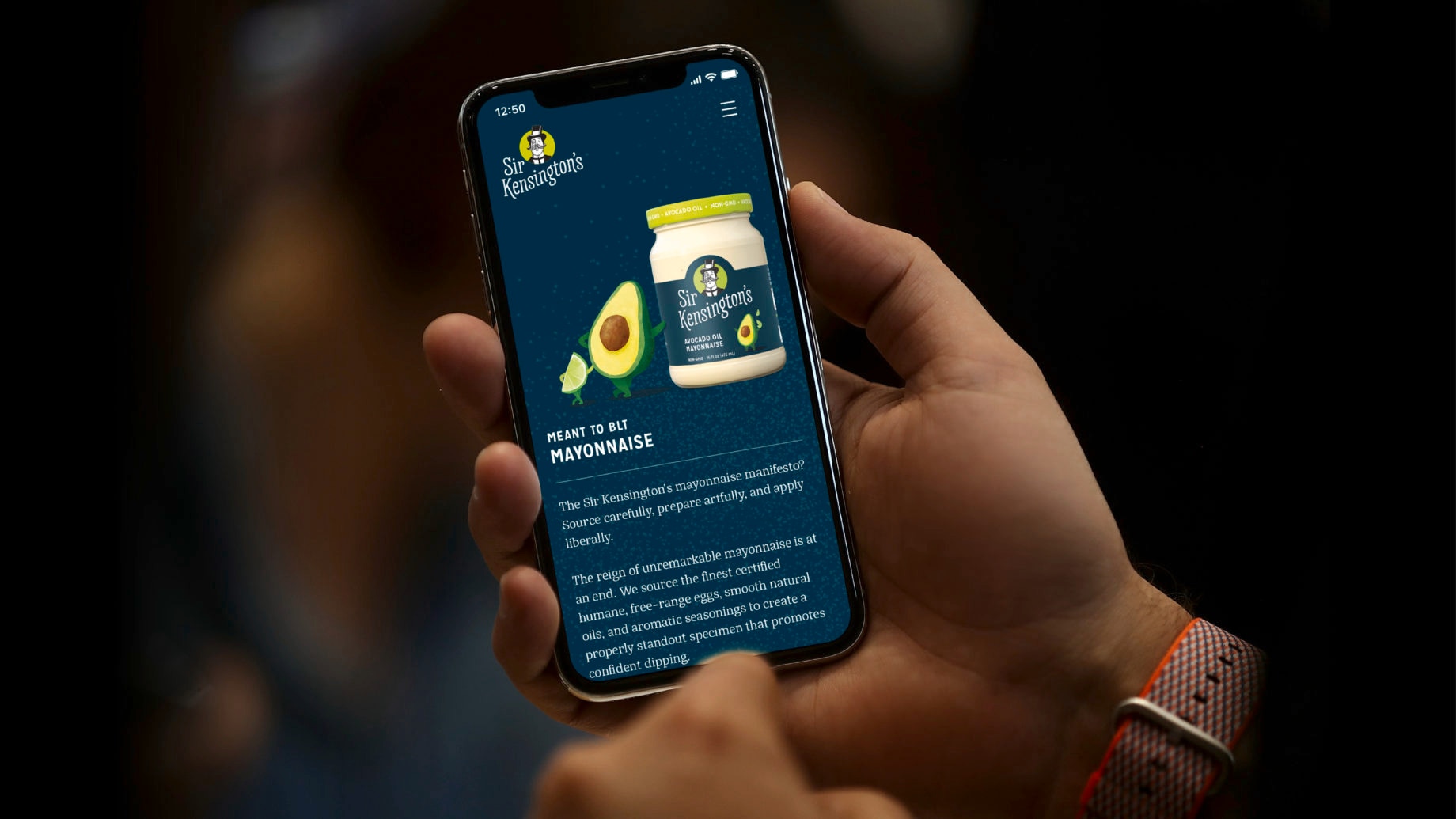
Our new website.
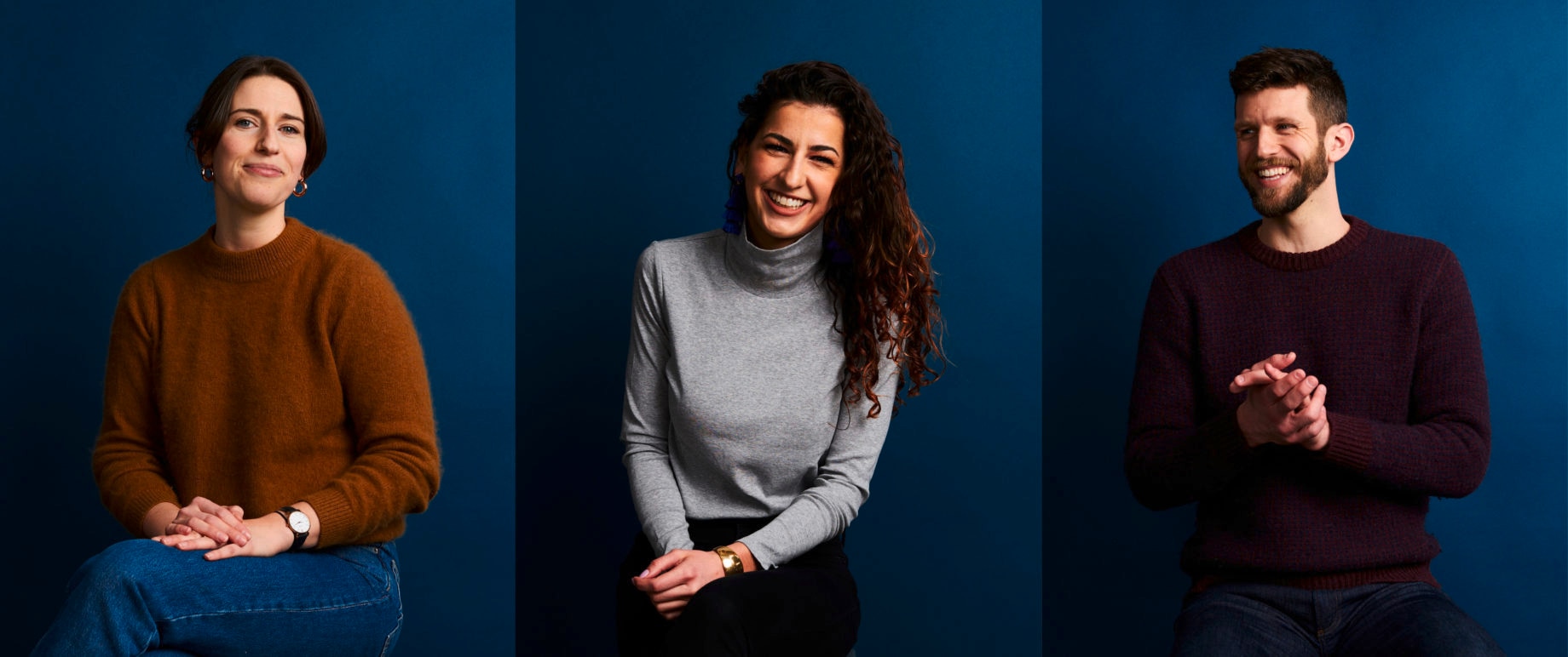
Team portraiture by Brian Pineda.
The brand redesign tackles several key areas, including improving shelf presence; increasing wordmark legibility and memorability; and strengthening communication hierarchy.
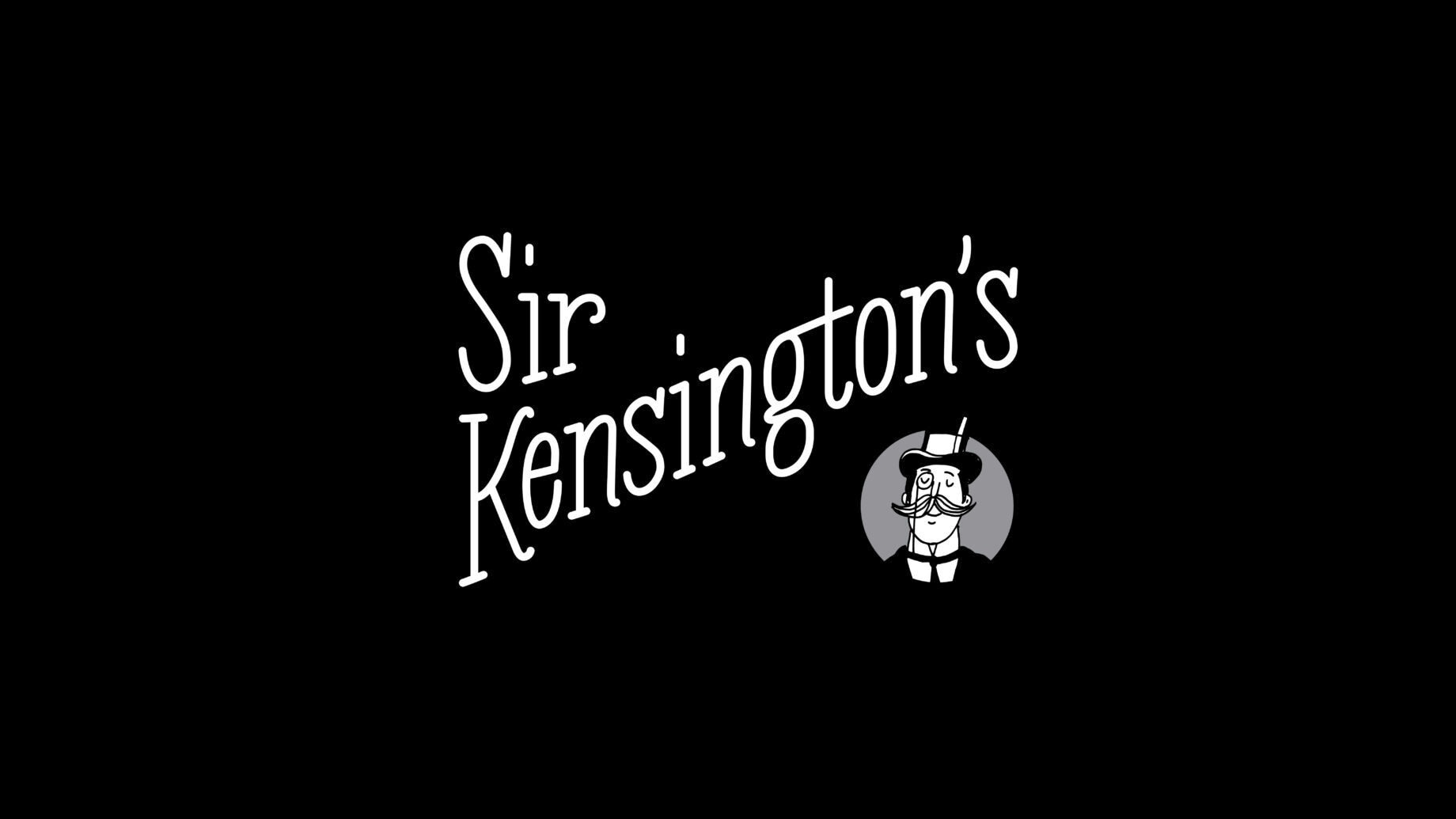
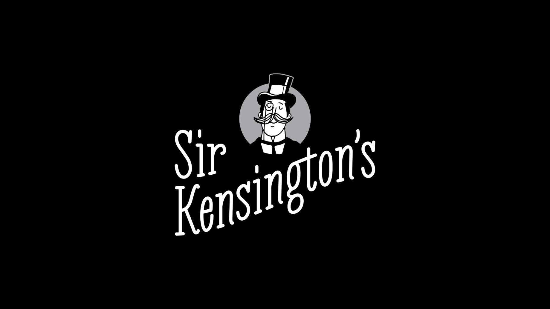
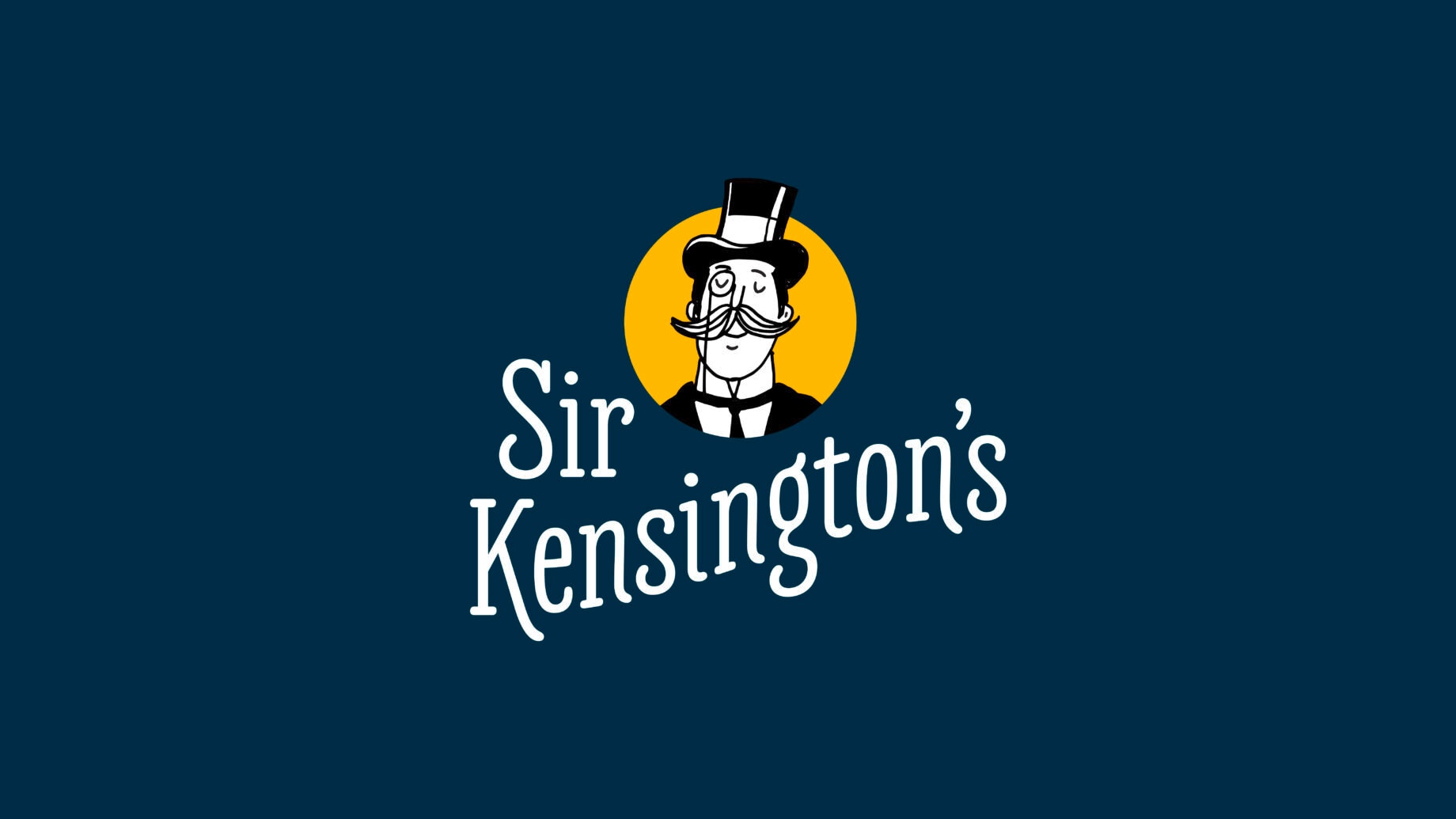
We developed a wordmark that is highly legible, warm and inviting, and lives harmoniously with our beloved Sir Kensington—a bridge-element we felt was important to keep intact. We’ve stacked the two words (the challengingly imbalanced pairing of “Sir” and “Kensington’s”) and moved from all caps to upper- and lowercase. All of this in service of a more compact, legible, and memorable wordmark.
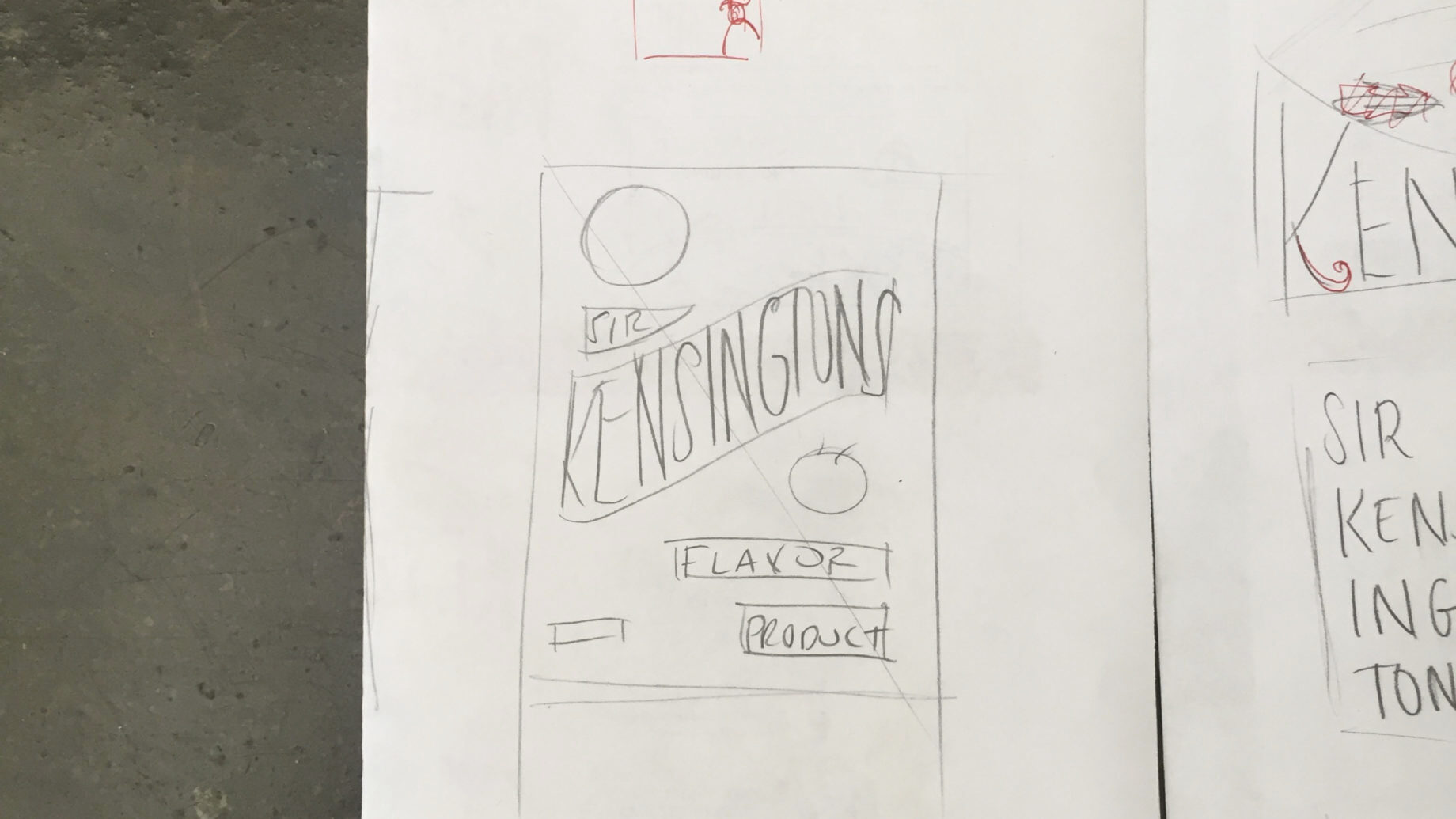
From a sketch that established our intended hierarchy and architecture, we worked with world-class letterer and typographer Jesse Ragan to develop our final artwork. The result is a wordmark like no other—a deliciously novel footprint and letterforms that keep up with the character and charm that come with Sir Kensington himself.
- blogteaser1
- blogteaser2
- blogteaser3
- blogteaser4
- blogteaser5
Our new logo works in a flexible color system that uses Midnight Blue as our new canvas—the plate upon which we dollop our new palette of delectable colors. These accents of color are like the flavor-notes that our products bring to a meal.
With an extremely strong in-house agency to carry the brand forward, we have the unique opportunity to establish a strong foundation of component parts that serves both our business and social impact endeavors.
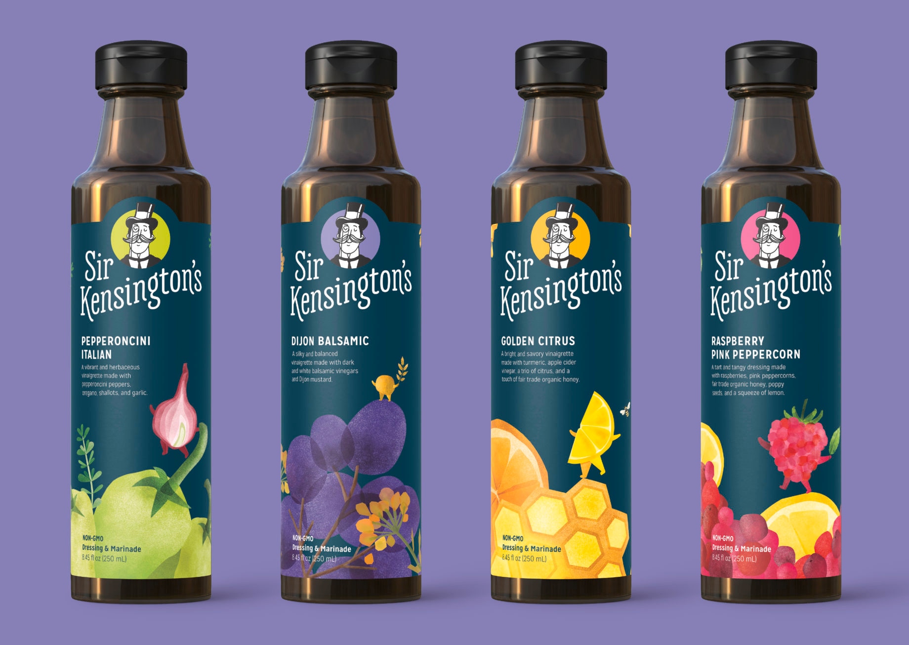
Our new packaging system is brand-forward and chockablock with charm.
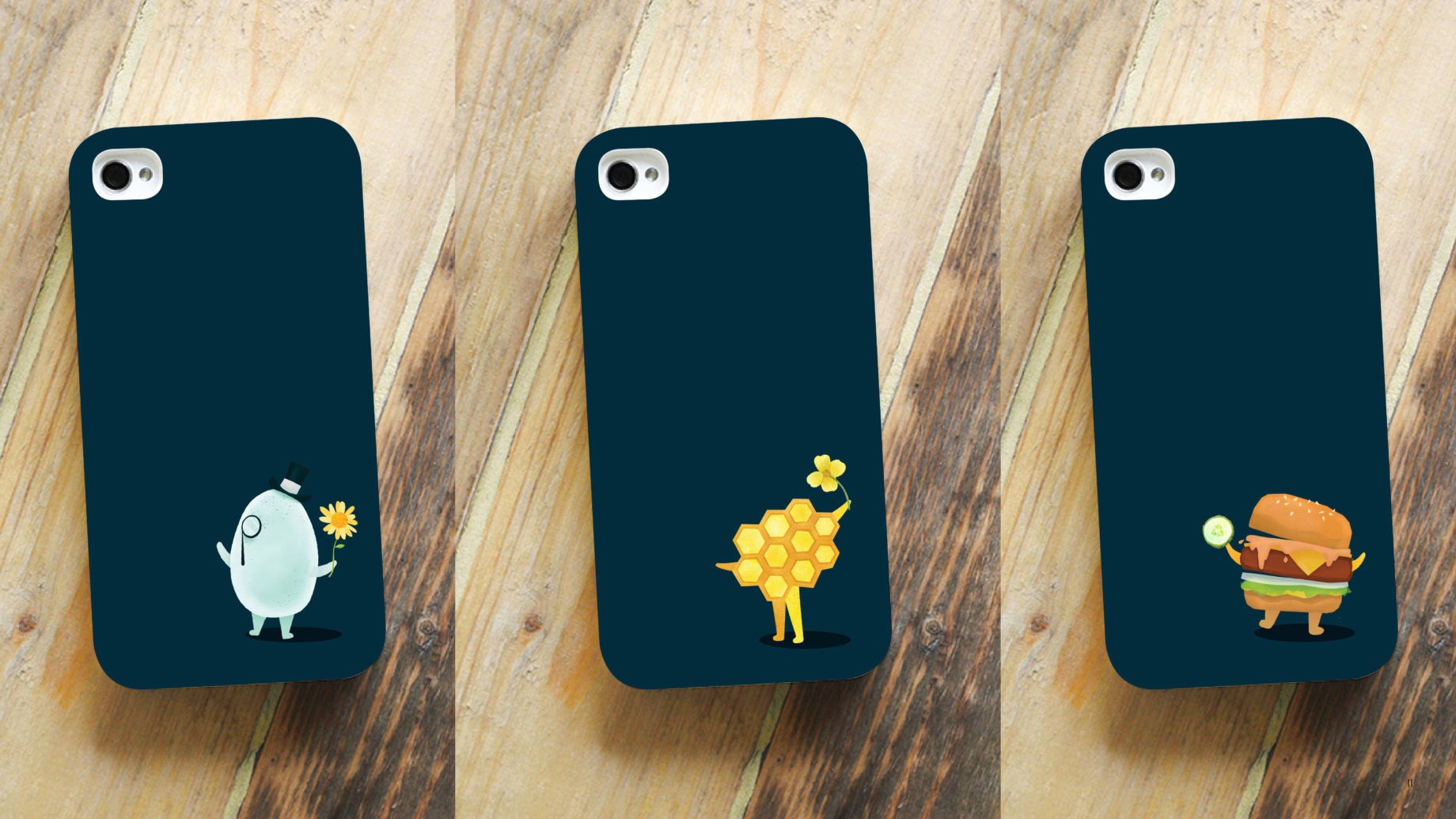
Here's to a brand and a visual system that keeps us honest when we sign off, "Always in good taste, Sir Kensington's."

